
Pirate’s Booty Rebrand: The Internet Hates It, But I Don’t Think It’s That Simple
The new Pirate’s Booty packaging has been making the rounds on LinkedIn, and like most rebrands that touch a beloved product, the comment section has turned into a full-blown design trial.
Designers are mad. Parents are nostalgic. People are mourning the old pirate like he was a childhood friend.
And I get it.
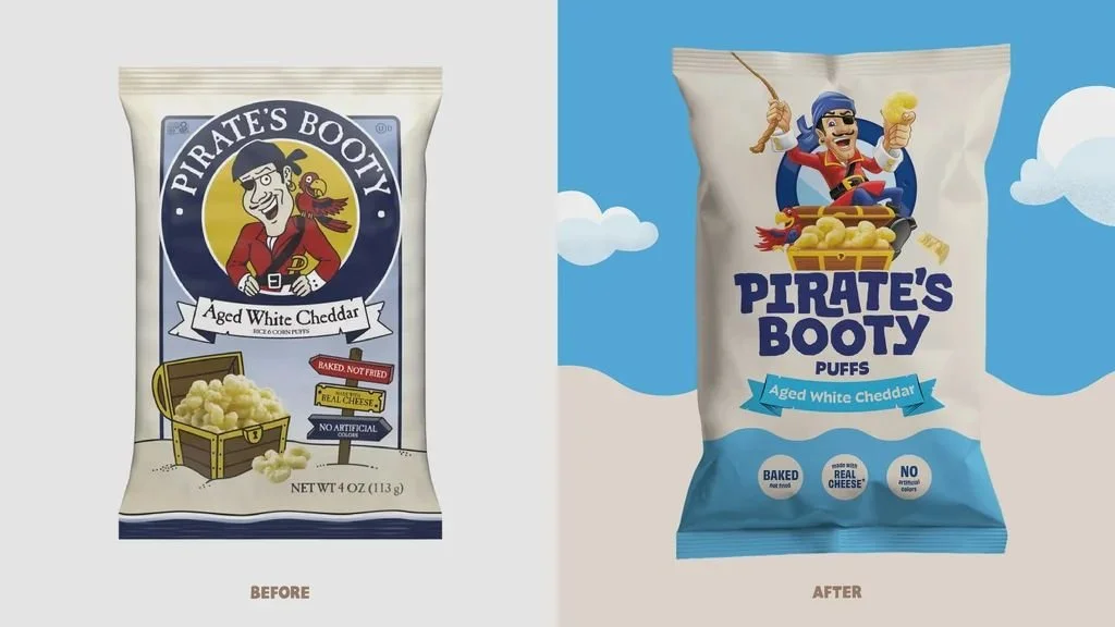
The old bag had charm. It had that hand-drawn, slightly weird, storybook energy that made Pirate’s Booty feel less like a corporate snack brand and more like something you randomly discovered in a lunchbox and never forgot. The pirate felt imperfect. The treasure chest was quirky. The layout had a natural-foods-meets-kids-adventure vibe that gave the brand a lot of personality.
The new bag is a totally different beast.
It is brighter, cleaner, louder, more animated, and much more digital. The pirate has been turned into a polished CGI-style character. The logo is bigger. The hierarchy is simpler. The blue is doing a lot more work. The whole thing feels less like a hand-drawn snack bag and more like a kids’ entertainment brand built for shelf, screen, and social.
Is it perfect? No.
But I don’t think it is the disaster everyone wants it to be either.
The Old Bag Had Soul. The New Bag Has Speed.
From a design perspective, the old packaging had more personality. No question.
It had texture. It had odd little details. It had a slightly homemade quality that made the brand feel approachable and different. You could argue that it had more ownable equity than the new design.
But it was also busy.
The badge, the pirate, the flavor banner, the claims, the treasure chest, the product illustration, the nautical framing — there was a lot fighting for attention. It worked because people knew it, but if you look at it through a modern retail lens, it was not exactly fast to read.
The new packaging is built for speed.
Big brand name. Clear flavor. Big mascot. Simple claims. Strong color blocking. Easy read from a few feet away.
That may not make designers fall in love, but it does make sense in a grocery aisle where the consumer gives you about two seconds before moving on.
The old bag told a story.
The new bag sells faster.
And whether we like it or not, that is often the brief.
The CGI Pirate Is the Lightning Rod
The biggest complaint is obvious: the pirate.
The old pirate felt hand-drawn, weird, and charming. The new pirate feels like he walked out of a kids’ streaming show, a mobile game, or a cereal commercial.
And for a lot of designers, that feels like a loss.
But here is where I think the conversation gets more interesting. We are judging this through a designer’s nostalgia filter. We are looking at craft, line work, character, imperfection, and brand equity.
Kids are not looking at it that way.
Today’s kids are growing up in a world of 3D animation, YouTube thumbnails, Roblox, Pixar-level character design, gaming skins, animated avatars, and AI-generated visuals. Their visual language is more dimensional, more polished, more digital, and more immediate.
So while the old pirate might feel more charming to us, the new pirate may actually feel more familiar to them.
That does not mean it is better designed. It means it may be better aligned with the audience Pirate’s Booty needs to win now.
And parents are part of that audience too.
Modern parents are scanning packaging differently. They want quick reassurance. Baked. Real cheese. No artificial colors. Better-for-you cues. Something their kid will actually want, but something they can still feel decent about throwing in a lunchbox.
The new design is clearly trying to hit both sides: fun for the kid, cleaner for the parent.
Pirate’s Booty Is Not a Legacy Snack Like Lay’s or Coke
This is the part I think a lot of people are missing.
Pirate’s Booty is loved, but it is not a legacy snack in the same way Lay’s, Doritos, Coca-Cola, or a classic soda can is.
Those brands live across generations. Parents buy them for themselves. They bring them to parties. They buy them on road trips. They eat them at barbecues. They are part of culture in a much broader, more permanent way.
Pirate’s Booty behaves differently.
For a lot of families, Pirate’s Booty enters the house during a specific parenting window. Young kids. School lunches. Park snacks. Beach bags. Preschool. Elementary school. The “I need something my kid will eat that does not feel like total junk” phase.
Then the kids get older.
And a lot of parents age out of buying it.
That changes the branding challenge.
Pirate’s Booty cannot only protect nostalgia for the parents who bought it ten years ago. It has to keep recruiting the next wave of parents and the next wave of kids.
That is a very different job than refreshing a Lay’s bag.
A true legacy snack can lean harder into recognition, memory, and cultural permanence. Pirate’s Booty has to stay relevant inside a moving window of childhood.
So yes, the new packaging may feel less nostalgic.
But the business probably needs it to feel more current.
What Actually Changed
The old packaging felt like a quirky natural snack with a pirate theme.
The new packaging feels like a kids’ snack brand with an entertainment system.
That is a big shift.
The old logo lived inside a badge. The new logo is loud, centered, and built to be read fast.
The old pirate was more of an emblem. The new pirate is a character.
The old color palette was cream, navy, gold, and a few small pops of red. The new palette brings in a much brighter blue, more open space, and a stronger visual block at the bottom of the bag.
The old product image felt like a little illustration moment. The new product world feels more dimensional and animated.
The old bag said: quirky, natural, trusted, a little odd.
The new bag says: fun, modern, kid-friendly, easy to buy.
You can argue that some personality was lost. I would agree.
But you can also argue that clarity, shelf impact, and kid appeal were gained.
That is the trade.
Where I Think It Misses
I still think the rebrand loses some of the brand’s original magic.
The old pirate had weirdness. The new pirate feels a bit too polished. The old pack had more texture and personality. The new one feels a little closer to the middle of the kids’ snack aisle.
That is always the danger when brands modernize.
You clean it up so much that you sand off the edges.
And Pirate’s Booty had good edges.
I would have liked to see more of the original hand-drawn soul carried into the new system. Keep the clarity. Keep the stronger hierarchy. Keep the brighter shelf presence. But maybe let the pirate stay a little stranger. A little more imperfect. A little more ownable.
Because the most interesting brands usually have some friction in them.
They are not too clean.
They are not too expected.
They have a little grit.
My Take
I do not think this is a perfect rebrand.
But I do think it has a job to do.
It brings Pirate’s Booty into a more current visual language. It makes the brand easier to read. It gives the packaging more shelf presence. It speaks more directly to today’s kids, who are fluent in CGI, gaming, animation, and digital characters. And it gives parents the quick product cues they need to make a fast decision.
Would I have protected more of the original charm? Absolutely.
Would I have pushed the character design to feel less generic and more ownable? Yes.
Would I have kept a little more of that oddball pirate energy? One hundred percent.
But rebrands are not just about making designers feel good. They are about repositioning a brand for where the market is going next.
And for Pirate’s Booty, that matters.
This is not a product that can only live off nostalgia. Parents move on. Kids grow up. New families enter the category every year.
The brand has to keep earning attention.
So while the old bag may have had more soul, the new bag probably has more commercial utility.
And that is the uncomfortable truth of the whole thing.
It may not be the rebrand designers wanted.
But it might be the rebrand the brand needed.